Following Saul Steinberg's 'Techniques at a party" in 1953 you are inspired to host( and illustrate) a party of your own.
From the summer project you already have seven guests.
The party takes place in a room which in itself has personality..the proportions of the space, the furnishings, the period, the way its is decorated are all distinctive.
Looking at a variety of artists, locate objects and characters in pictorial spaces.
All of the guests, at least seven as well as the host- this is to do a self portrait- are interesting because of the ways they are depicted, each one in a different style, They are not invited because you like them, but because they are distinctive individuals.
Invitation did specify ' formal dress' but may guests have chosen to ignore this.
Output for this project is finished art work 250mm h by 400mm w.
Firstly I have looked at some illustrators that will inspire me in order to create this party, looking more specifically at the style of the artist, deconstructing and saying what I like about the image/ style.
ARTISTS RESEARCH
DALE EDWIN MURRAY
Looking at Dale Edwin Murrays, work he uses a lot of simple lines to create his characters, faces, and few lines to create them too, along with a basic shape that has been manipulated to create the shape of the face.. But with this he manages to express the characters emotions/ feelings well. For the body of the character he uses simple block colours and outlines which capture what the character is doing or how the character is moving. It is clear what the characters are doing in every image which is important so that the audience does not get confused about the actions, and characters work well together.
Mainly used in the background he uses colours added with an almost cross-hatch pattern. This is the main thing I really like about his work as it makes the characters/ main part stand out.
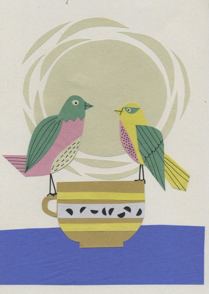
JANE ORMES
Jane Ormes uses silk printing to create her work. Using simple shapes to create exciting patterns, her work features birds and anything environmental such a plants and trees, her images have few objects or animals, but her composition is very good., The work almost looks delicate, using bright colours that combine well.
This is something I would like to look at further, possibly in this project, colours and patterns that work well together.
MARCUS WALTERS
These two images I picked out because one the first one it looks like he has used some materials such as card board, stamps and tape to maybe represent an idea, maybe from trying to save forests??, it works well because of the way he has represented trees, we all know they have leaves but by using an outline on a variety or types of tree and using them together it creates interest.
On the second image I this the combination of blocks or colour and lines work really well.
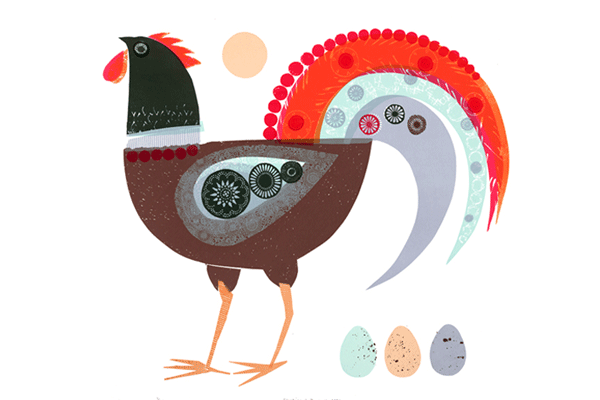
MATTE STEPHANS
I love how in many of his pieces he uses different shades of the same colour, or colours with very subtle differences. the city scene images are very busy, and like many of the artists show a representation of something- in this case buildings.
In this one its very busy with more of a close up of the buildings, using pastel shades for the buildings, with darker pastel colours for the windows. the simple outlines for all the detail work against the colours. The buildings look quirky, and slanted.
Using blocks of colour for most part of this piece, works well against the cheerful patterns of the hot air balloon, the characters are quite "square", and stand out against the pale background. The lines are edges of each object make it clear as to what is what.
RENE MAGRITTE
In Rene Magritte's work she uses very realistic patterns such as clouds. Even the buildings look quite real by simply creating a shadow on the windows, with the repetition and scaled down men. across the canvas.
This image I choose because of the use of realistic pattern of the clouds which is cut in the shape of a bird. The outline of he shape and pattern combined work well.
I find the trees on this very interesting, still holding all the detail of a tree, but in a leaf/tree shape, this has been represented well and makes a striking image.
In other works, its seems as if he uses an image that almost has this cut out effect to reveal another image, I think this is something I would like to consider in my final art work.
KEITARO SUHIHARA
Yesterday I found an artist called Keitaro Sugihara, I absolutely love this work,using collage,within collage, making little details within patterns. Creating textured by scrunching paper and using newsprint have worked really well. The images are very quirky by scaling up and down certain parts of the image, and the use of colours are bright but not over-powering. Using simple shapes for the main part of the image and the smaller detail of the flowers, making something so ordinary exciting.
The second stage is to look at illustrators who have combined characters together in order to look at how the characters interact.Talking to Jamie ( one of my tutors), he said this was an important part of the process- working on how your characters work with each other, and to try and make it fun and lively.
JANET WOOLLEY
MELVYN EVANS
MAX BECKMANN
PHIL WRIGGLESWORTH
SAUL STEINBERG
Speaking to Howard( another tutor) he said somehow in this you need to look at a selection of artists and evaluate what you like about their work, and by doing this combining the bits you like and to filter it through myself, so it has some parts from a variety of illustrators but can show you as an illustrator as well.